Wednesday 30 December 2009

Problems DVD Studio Playback

Here i am having a problem with playback of my sequence. I have tried a number of different formats when you have the option of exporting as a mov but changing the settings and this green strip still happens. After searching the net i cant find any soultion therefor i plan to leave it and ask the teaching staff when i return to college.

I have looked at all the logical idea like linked files and diffrent formats but no matter what i try i keep getting this problem.

Poster In There Surroundings

Here i have placed the posters in there surroundings ,that being a billboard and magazine

Tuesday 29 December 2009

Posters


I have now designed my posters and instead of using a still from my sequence i have decided to keep my cultural refrence to cowboys. I have designed the poster as a wanted poster with an image of the creator of the drink Jack Daniel then i have weathered the image to give it more of a style.

Sequence After Crit


Here is my sequence after the class crit after changes like adding a herd of bulls, mountains and clouds. Also removing the gunshots at the end due to advertising rules

Developed Ideas

Here i have developed objects for my sequence after class crit suggestions ...

Cactus
Mountains

Planning changes From Commets

Crit Suggestions I plan to do

  • Put more bull behind the fence, then multiply to replicate a herd
  • Keep swinging arm when bucking
  • Follow the cowboy when flying
  • Create more in background like mountains and cactus
  • Flip arm so the thumb is on the inside
My Plans from Other Suggestions (in red is my idea / plan )
  • Develop the jump of the man on to the bull - I plan to make the man more flexible when he jumps on the bull
  • Move the arm when walking - I plan only to sway it a little
  • The background is moving in the wrong direction - It seems like that to the eye when but it is moving the right way
  • Horizon is too high - I feel that it is at a right hight because I wan to imply that it is a wide spreading desert
  • Could make guitar guy different to flying guy and the flying guy goes past - I can get a different colour leather for the waistcoat and make a different cowboy
  • Cant use gun sounds due to advertsing rules - This is right after I recapped on my research

Class Crit Comments

Here are the comments that i got during my class crit .....

  • Develop the jump of the man on to the bull
  • Move the arm when walking
  • Put more bull behind the fence, then multiply to replicate a herd
  • Keep swinging arm when bucking
  • Follow the cowboy when flying
  • The background is moving in the wrong direction
  • Create more in background like mountains and cactus
  • Horizon is too high
  • Leave dust if the cowboy lands to imply a rough landing
  • Could make guitar guy different to flying guy and the flying guy goes past
  • Flip arm so the thumb is on the inside
  • Cant use gun sounds due to advertsing rules
  • Could use sounds like bull, lasso and ye ha
  • Could add clouds to the sky to add more character

Sequence Before Class Crit


Here is my sequence before the class crit. I can see some suggestions being made to my sequence. i feel that i could improve the movement of the figure a bit better also i have a feeling that i can use gunshot noises.

Move To the Beat


After having the suggestion of moving a part of the cowboy to the beat of the music i decided to research it and test it. After searching the net i found a site(http://www.pixel2life.com/publish/tutorials/70/animating_with_sound/) that showed how to do this. The way in which this was done was by using the audio amplitued function and only using the both channels of the music. I then placed the arm so it looked like it was playing the guitar.

Eye Experiment

After having the suggestion of adding face features to my character i have decided to add a animated eye instead of a whole face. This is because i feel that by adding an eye it is enough to give the animation charter.


This animation was created by having diffrent shaped eye lids and creating the motion of the eyelids open and shut

Tumbleweed

After looking at my animatic suggestions i explored what a tumbleweed looked like made out of grass. After scanning it in a few different shapes i decided to scrap the use of a tumbleweed in my new sequence.

Diffrent Camera Views

After looking at my suggestions i have decided to familiarize myself with the different camera views there are so when i comes to planning my new sequence i can get an idea of what it will look like...

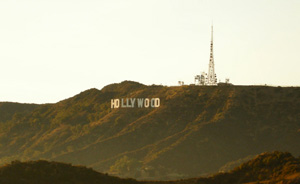
Extreme long shot
Extreme Long Shot showing Hollywood sign

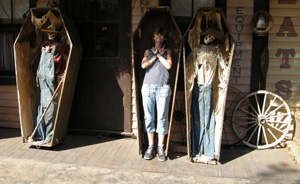
Long Shot
Long shot

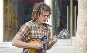
Medium Shot
Medium shot of a street musician

Close up
close up

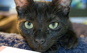
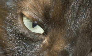
Extreme Close-Up
Extreme Close up of a cat's eye

Images from http://www.mediaknowall.com/camangles.html

Comments on Animatics

After asking for comments about my animatics from classmates and teaching staff this is the feedback that I got...

  • improve the style of the tumbe weed/ brush
  • make Jack Daniels poster look weathered
  • Do not use the photo inside the saloon
  • Keep the saloon building
  • separately animate the bull
  • loose the long background strip
  • too predictable
  • add detail to cow
  • add different camera views
  • split the legs but so they move together parent the layers
  • shift the poster to the left or right
  • enlarge the slogan
  • add slogan word by word
  • add depth or texture to the floor
  • blur the horizon
  • move something to the beat of the music
  • add a face
  • could use twigs or grass for tumble weed

Monday 28 December 2009

Animatic


Here is the animatic of my advert, I wanted to get as close as I could to my finished product so I added as much detail as possible. I done this by adding the music, saloon and animated cowboy.

Split Pin Cow

Here i have created a bull that can move, i have done this by using split pins. The reason that i i have done this is because i can plan the animation of my bull in my sequence. After showing this to other people i have had the suggestion of using the cow as a stop motion sequence. After thinking about that suggestion i think that it would not work for a number of reasons, but the main reason is that it would not work with the digitally animated cowboy.

Chosen Music - The Airborne Toxic Event


After getting a suggestion of this track from a classmate i have decided to use it. The reason that i think that this is a good choice is because it is a modern take on country music. Within this tract i have found a 30 second period where there is no speech. The reason that i think it is best to use a period with no speech is because i feel that the speech would distract the viewer from the advert.

Material Scans

After coming up with some ideas one that i plan to use is creating a animated cowboy with materials. Here I have created a waistcoat and jeans using leather and denim to give the character a handmade look but using real life material.

Monday 16 November 2009

Ask The Guy Who Attaches The Billboards

After researching billboards over the weekend i have come to the conclusion that the most common billboard size is a 48 sheet which is 6096mm x 3048mm . Therefore after seeing billboards this size many of times in and around places i feel that this is the size i will make my printed billboard.

Then i got confused on my way to college looking at the Lewes train station billboards because after looking at so many sizes i had all these figures going round in my head and wondered weather the Lewes billboards were a 48 sheet board. Then I saw that a new advert was being attached to the board by a worker therefore i thought instead of getting confused just go up and ask the worker and he assured me that the boards opposite Lewes station were a 48 sheet board. This means that when it comes into adding our completed images to the situation of being placed on a billboard i can take a photo of this board and know that it is the right size.

This also helps me when it comes to planning the size of my billboard advert because it does not have to be the same size but to scale therefore if the original size is...

6096mm x 3048mm

I could make it a tenth of the size and it would be

60.96cm x 30.48cm

Saturday 14 November 2009

Current Jack Daniels Advert


Here is the current Jack Daniels advert with the title "His Way". The reason that it has this title is because it is describing how Jack Daniel made his whiskey. After looking at this advert i have decided to go a more cultural reference to cowboys for my advert. And i might put in a bucking bull.

Wednesday 11 November 2009

Ideas From Deadwood Title Sequence


Now i have found a source of music its time to start thinking of some ideas. I thought that by doing this i could analyze a tv show sequence and the first one that come into my head was Deadwood. This is a show that it set in the same time that Jack Daniels was Developed in the 1870s and the title sequence represents a lot of situations around in the 1870s. these situations include...
  • Mining
  • Gold Panning
  • Whisky Shots in a dark Saloon
  • Saloon
Therefore after watching this i feel i have a much better vision of that time period

Music Choice

Now I know that my drink is Jack Daniels I should start to think about my music choice. Therefore after previous research finding out that Jack Daniels is associated with country music therefore i come up with the idea instead of searching over a wide variety of artists i could just buy a compilation album of hits to find the right track. With this album having well known artists such as Johnny Cash, Dolly Parton, Roy Orbison & Elvis Presley I am sure i will find the right track for my sequence.

Drink Ideas

With this brief being so open to what drinks we can advertise, i have thought that i would like to do either Kopperber cider brand or Jack Daniels Whisky therefore i and going to research into both of them....

Kopperberg - Brief Info


  • Kopparberg's is the largest beer and cider of Sweden
  • It was originally founded by a group of small brewers
  • The Kopparberg's factory was built in 1945 and operated at capacity until 1988 when it was taken over by a Swiss brewery
  • In 1993 brewery close and was left in the possession of the bank
  • The brewery was reopened in early 1994 by brothers Peter and Dan-Anders Bronsman who have been running the business since

Jack Daniel's - Brief Info


  • Jack Daniel's is a brand of Tennessee Whiskey
  • One of the world's best-selling liquors
  • Is known for its square bottles and black label
  • It has been prominently featured in movies, songs, and novels
  • strongly linked to Rock & Roll , Country Music & American bikers
  • The brand is produced in Lynchburg, Tennessee
My Decision

after looking into the brands I feel that I would be much better if i was to use Jack Daniels as my project because i feel that i could give it a much better handmade look rather than kopperberg due to the time period it was made

Research - Lemony Snicket´s End credits


When looking at this sequence i feel that it has a home made feeling to it for a number of reasons. The first being the fact that its figures and forms have a painted and textured paper look to them. The second reason that I think it looks handmade is because is because of the flow of animation, this is because it looks a if it is filmed papercraft animations. Finally looking at the look and feel of the sequence it has a very dark feeling to it also there is an effect to the camera view where the light keeps fading in and out as if more and less light is in the room.

Research - Catch Me if You Can Title Sequence


When looking at this sequence i feel that it has a home made feeling to it for a number of reasons. The first being the fact that it has a Saul Bass style to the figures and sets. The second reason that I think it looks handmade is because it feels and looks as if the figures have been drawn and scaned in and layered then animated while layered. Finally the last element that makes it look Handmade is the animation of the cars, this is because the animation is not smooth it moves in a much more squareed/blocked style

Monday 9 November 2009

New Project : Handmade

With this new project being handmade i feel that i am going to enjoy this. The reason i say this is because it combines craft, design and digital software. Also there is the fact that it has an advertising element to it. We have been asked to create a poster, a magazine and moving image advert. Also create the moving image compatible for smart phones. These adverts are for and alcoholic drink of our choice, so i am most likely going to choose Jack Daniels Whiskey.

Monday 2 November 2009

Conclusion

Now i have completed my project i feel that i have done well in my production. looking at my filming i feel that the quality could have been better but the reason for its grainy look is because of using the zi6 inside. While filming my solution was to angle the spot lights to the area i was filming and this improved the footage.

looking at my film before my after effects i feel that i like the pace of the film because it feels speedy due to the anger shown in the fist hit. My use of only sound effects i feel adds a slight comical element while showing anger.

Now looking at my use of after effects i feel that my development of ideas and skills in after effects has gone well. for example my use of the ripple effect looking like a ripple in a pond then by developing my ideas and knowledge of effects to turbulent displacement and animated it. Once i had brought a dictionary of effects i found that i knew what i wanted to add.

looking at my film as a whole i feel that i am very happy with my end result. I feel that i have used a number of effects on my sequence that i feel have improved the emphasis that i am trying to put across. The effects that i am most happy with is the write on with the post it and the heat wave development.

When i look at my project as a whole i am very happy with my end result and the overall out come. And as far as my software knowledge development has gone i feel that i have learned more anlong the lines of video editing and and emphasis

Thursday 29 October 2009

Final Sequence

Here is my final sequence that i am submitting, like i said in my previous blog entry i have done all the things that i said i would

Wednesday 28 October 2009

My feeling on Second Crit

after having that second crit my feeling are that i should loose the double beat because I didn’t feel it was right, i should sort out the ahh so it dosent cut off, i am going to keep the orange circle because this is to replicate a oven element and keep the zoom out because I feel that this resembles relaxing.

Tuesday 27 October 2009

Edited After Crit


Here is my video after my crit, i have made the changes that were suggested by classmates and i have also added a double beat to the soundtrack to create more impact on the viewer.

Then i uploaded the video to you tube and asked class mates to comment on the sequence and here is my feedback

• Double beat (mixed feeling was and was’nt good)
• I don't like how the "Ahhh" cuts out at the end
• The heat waves in the oven are good
• I don't know about that orange circle thing
• All the salad stuff is good
• Removing the blue from that electric effect has made it look better
• At the end maybe zoom in instead of out, or just keep it still.

Sunday 25 October 2009

Crit Ajustments plans

Here i have my suggestion from my crit
  • Heat waves should be less wobbly at first and more as they go through the film
  • When getting meal out of the oven they should be more heat waves
  • Change static colour (gray would be a good colour)
  • Try a different effect for the ending, tilt dosent work
  • The ripple needs tweaking
here are what i plan to do now that i have had my crit

  • Increased the wave size throughout the film
  • Add a colour glow in the oven
  • Add a oven glow where the heat comes from
  • Change the lightening to grey and turn down the opacity
  • Changthe tilt to a zoom
  • Change the ripple to a more convincing effect

Friday 23 October 2009

Class Crit Comments

Here are the suggestions of my classmates

• Heat waves should be less wobbly at first and more as they go through the film
• When getting meal out of the oven they should be more heat waves
• Add a colour glow in the oven
• The ripple needs tweaking
• Look at desert heat for heat waves
• Reduce ripple & add a glow
• Like static
• Like bag explosion
• Change static colour (gray would be a good colour)
• Pase of the film could be worked on
• Try a different effect for the ending, tilt dosent work
• Ahh could be longer
• Steam workes well
• Could use zoom for ending

Monday 19 October 2009

Creating Steam


Here is my steam effect that i have created to give the impression of the chicken meal being hot. i created this steam using particle world and adjusting a number of settings to make the effect seem authentic. I have used steam around four times in my sequence so here i feel that i have created a useful effect for my sequence

Friday 16 October 2009

Effects brainstorm

Here are some effects i am thinking of using
  • Camera Shake,
  • zoom
  • Writing Text,
  • sparks
  • underline the word pub
  • Still then Camera Shake
  • blur
  • Frosty
  • Condensation
  • Fire Ring
  • heat waves
  • smoke
  • impact
  • lightening
  • Explosion
  • turbulence
  • Camera Tilt
I hope that these effects will create the mood of the film that i am hopeing for

Wednesday 14 October 2009

Write on First Try


Here is my first try at the effect write on, this effect gives the sequence an effect of the letters being written by a human because i have used a handwriting looking font. Then by uncovering the font in a handwriting style it makes it look more realistic .


After creating that effect i applied it to some of my filmed footage to see how it will look on my sequence. I feel that this works very well.

After Effects Book - Useful

Content Of The Book

Covers CS4
This cookbook contains recipe after recipe that allow you to harness the full power of the native plug-in effects in the After Effects application. In a step-by-step manner, author Chad Perkins guides you through the creation and application of each and every native plug-in effect available for use in the AE toolset. The book also shows you how each can be used optimally in your media project, when and why it makes sense to use each, and also how to combine multiple effects.

From color correction effects to distortion effects to stimulation effects and all in between, this book puts the full power of the AE plug-in effects in your hands. It shows you how to create, among others:
- the shatter effect
- the fractal noise effect
- the glow effects
- the Particle playground effect
- the 3D Channel Extract effect
- the Colorama effect

My Opinion

after scouring this book i have found a number of effect within this book that i would find useful with my sequence. The effect that would be most useful is that of the write on, this is useful to me because i have a post it with writing on in my sequence and the filming made it blur. Therefore i could write my message with the write on effect.

Thursday 8 October 2009

Edit After Peers Comments


After adding sounds and showing class mates i had suggestion that my placing the meal in te ovqn scene was too slow. This is because i filmed it too slow and sped it up by 20% in final cut, this looked slower and like it had a ghost. so by increasing it by another 30% bring its speed up to 150% looks just right.

Wednesday 7 October 2009

Sequence With Sound


Here is my edit of my sequence with sound effects placed where i feel that they work. After spending all day creating my sequence i am happy how i is constructed. This sequence is constructed after my talk with Kate and review of my previous sequence sounds and construction. This is because i felt that my sounds were becoming too comical after i wanted rage due to the post it scene.

Also my post is scene was too short for the viewing time because something on screen had to be read therefor with Kate's help the identification of the length of my scenes was easier to see and i could chop frames here and there also there was a scene that had no real use therefore i could chop it out. After choping this out i didnt need to edit frames of other scenes, and now i look at my sequence if i choped frames here and there the sequence would seem too short.

Sound FX

Knowing everyone is going to need sound effects here are six websites i have found that offer free downloads...

Absolute Sound Effects Archive
Media College
Flash Kit
PacDV
Partners in Rhyme
Free Loops

Sound Bible

To anybody who wants 1200 + sound effects just ask me because i have a disk which i got free with a magazine so ask me and i will give you the files.


Tuesday 6 October 2009

First Edit


Here is my first edit of my sequence with no sound. I plan to analyse the length and layout of this sequence and make finer edits to the sequence. I am currently searching for sounds to place on the sequence to give it more character.

Looking at the sequence as a whole i feel that i am pleased with the length and layout of my sequence only i need to chop out a few frames here and there.

Monday 5 October 2009

Filming Results


After filming I have found that when looking at my footage on the zi6 it looked fine but when it come to looking at it on the monitor the footage looked grainey. therefore i am going to look into improving the footage, but at the same time i could use this to my advantage with setting a mood.

Animatic


Here is the result of me sacnning my large storyboards and placing them in sequence in after effects. You will notice that some of the scenes are stationery for example the establishing scene, this is because i plan for some scenes to be stationery within my sequence. Also other sataionery scenes are because i could not edit the images for animation. Therefore i have only animated the images that i could. After creating this i am happy with how my sequenc will run.

Storyboards For Anamatics

Here I have drawn my storyboards for my animatics ans you can see i have used a range of pens for there thickness. I have done this to show different surfaces for example the bottom one i have used a thick marker to show a table top and a thin cd drawing pen to show the fast motion of the fist hitting the table.

Idea Developement

After looking at my ideas I have decided to go along with my making diner idea. With this idea i am planning on using anger or rage for the mood because I can use sound of impacts to set the mood. Also with the oven I can use a roaring noise when it comes to open the oven.

Friday 2 October 2009

Screen Resolution

After class i have recaped on screen sizes and here is a demonstration on screen sizes and there resolution coloure coded

Ideas

After thinking about my subject i have come up with these ideas...

• Turning on Mac Pro, ripping disk & adding to iPhone
• Making a cup of tea
• Leaving home in the morning and going to uni
• Walk along the beach
• Making a salad dinner

I will most likely go with the dinner idea because of the rapid shots i can do with salad

Sunday 27 September 2009

Research - 60's Batman Fights


With the sequence that i have to create giving emphasis to action i thought that it would be worth researching the 60s Batman tv series fights. This sequence has most of the top villains fighting batman and robin. With the emphasis being shown through animated words and peakes in the audio. These techniques grab peoples attention and make them pay more attention to details within the films.

Wednesday 23 September 2009

Research - Rapid Cut Animation - The 30 Second Bunnies


The 30-Second Bunnies Theatre Library


After thinking about my research i rememberd wayching these sequences off the link above. these are animations of the best bits of various famous films applied to rabbits and placed in sequence. After watching 10 of these animations of 30 seconds i have found that they have an average of 28 cuts.

Monday 21 September 2009

Crash Bang Wallop

First day back and we have been set our new project called Crash Bang Wallop. Being a rapid cut film I intend to research other rapid cut sequences that i remember from a website. Also being a film that needs a mood i intend to research films that have been converted from book to film and comic strip to film.

Thursday 4 June 2009

RSS - enclosure

This is the code for the enclosure, this code is so i can attach the video file to the rss. The "lenght" is the figures for how many bytes the file is all togeather.

RSS - Episode Codes

This code is the way in which the podcast has a title for seperate episodes therefore i have added my corresponding episode title and a description

RSS - itunes

This code is the way in which the podcast adds tags in itunes. These tags are the key words for the podcast, the subtitles and the categories.

RSS - podcast series title and description

This code is the way in which the podcast series are tagged, then there is the use of a universal description

Monday 1 June 2009

Essay

Now i have complected my essay i am pleased with there results. The essay title was "Where did podcasting originate from and what keeps it going", this essay looked at a number of different elements. This includes development of hardware before the ipod, the launch of an ipod and the development of podcasting.

After reading through my essay am happy with how it has ended and the way that i have found out the dates and how podcasting has originated from.

Thursday 28 May 2009

Colour Correction - Cutaways

Now i have dome the interview colour correction its time to start the cutaways. Here is an example of how i have done the cutaways. Here is what it looked like before

I then ajusted the colour wheels to these settings

to create these tones within the footage


Wednesday 27 May 2009

Colour Correction - Interview

Now I have completed my sequence I thought that the first place i should start with colour correction is the interview and so i did. Here is what the footage looked like first

I then ajusted the colour charts to these settings

which then gave me this warm and cool looking shot


Tuesday 26 May 2009

Colour Correction Tips

After having the demonstration on how to colour correct I asked if there was any more tips and they were...
  • Clear mid tones
  • High Light & Dark
  • lower is better
  • little with colour
  • be warm and cool
  • whites just under 100%
  • up a little with saturation

Monday 25 May 2009

Intro Screens


After retrieving the files for the intro screens after having problems with the font attached to the email, i have created my screens. The first being the universal one that all of use use and the second being the question that we were issued. I did have problems with these at first because i forgot to flatten the PSD before saving. This meant that when i imported the file into FCP the color overlay that was on the logo was not seen and we saw the original colours of the logo therefor i went back and flattened the document then re inported it which ment it came out as you see it above.

Friday 22 May 2009

Solution To Cutaways

After the problems that we have had this week over the cutaways this week there has been a number of suggestions on how we are going to know who is using what over the holidays so the were two ideas proposed. The first that we all put screen grabs on the surver and create a contact sheet and see how many people are using the same clip. That only worked to a certain degree because not everyone was in class. Then the second plan was to create a blog where we can post the screen grabs over the holiday and dodge using each others cutaways.

Wednesday 20 May 2009

More Cutaways

After reslising we needed more cutaways the has been more filming going on by everyone today so that we can boost the libary. But once again there may be problems because we are coming up to the holiday and how are we going to know over the holiday who is using what, therefor as a class we need to plan something.

Tuesday 19 May 2009

Intro & lowerthirds

Now I have my sequence compleated there is the task of sorting out the introduction and lowerthirds with the info on it.

first I created the intro with a black PSD at 720x576 and placed it at the start of my sequence for one second and had half a second fade out. Then there was the task of creating the lowerthirds, we wanted it to be universal so we created the black bar and cropped it top 70 and bottom 10, and then we all used the same font(Arial) at the same size(36/40 pps) and the text needed a drop shadow. Therefor we had a universal look like this ...

Friday 15 May 2009

Cutaway Train Wreck

After doing a class crit we all realized the there was a large amount of repetition of the same cutaway from the library. Therefore we thought that we needed more cutaways because wen we started we thought that there would be so many we didn't even think this would happen. Therefor next week will be another cutaway shooting sessions but there are problems with this. when we are in on a wensday it is a quiet campus and the same for firday so there will be very little people around.

Thursday 14 May 2009

Defeating "ERM" In question


I found that my subject "ERM" a lot and she said this most in my last question so first I created the sequence of the interview and then decided to to a stream of four cutways because where I have used the razor tool the jumps in the sequence are obvious. Therefore in the last cutaway I cross dissolved on my last piece of the question and podcast so I had a reasionable amount of footage at the end.

Wednesday 13 May 2009

Manual Cross Dissolve


As I have found out with a lot of my cutaways there is not enough time handles for a cross dissolve to be applied. Therefore as a guideline I used the line that is just above halfway on each row of the timeline, used the pen tool and lowered the opacity on the previous clip and raised the next clip. hence creating a cross dissolve.